I Built a Live Map of My Own Blog
I write constantly about giving complex things a map and a vocabulary. My own blog did not have one. So I directed an agent to read the site as a graph, and the first thing the map did was catch me. A build log, a deliverable, and what I hope to learn as I improve it.
I tell people, constantly, that the way to take hold of a complex thing is to give it a map and a vocabulary. I just published a field guide making exactly that argument about sound: that you cannot fix what you cannot name. I believe it enough to have built a career on it.
Then I looked at my own blog and realized it had no map at all. I could not have told you, quickly and accurately, which pages were the important ones, which pages pointed at which, or where the holes were. The cobbler's children have no shoes. So I sat down with an agent and built the map, and the building of it is as much the point as the map itself.
How this actually got made
I did not write most of the code here. I directed it. That is how nearly all of my work happens now, and it is worth being specific about, because "I used AI" is not a method, and the method is the whole thing.
I started from intent, not a prompt: I want to see this site as a graph, every page a node, every internal link an edge, colored by the role each page plays. Then I handed the building to an agent and stayed in the two seats only I can sit in, deciding what it should be and verifying what came back. The generator, the drift report, the interactive view, and the page you are reading: most of the typing was the machine's. The decisions were mine, and so was every bug I had to catch, of which there were several, because this is real work and real work bites you. I wrote the longer version of this working method in the AI-assisted engineering HOWTO, and how I check what the agent hands back in my code-review workflow. This article is one of those loops, run in public.
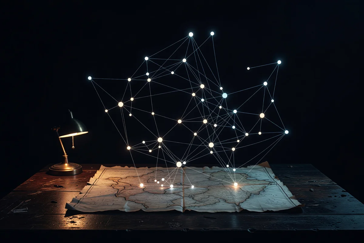
What the map is made of
A blog is a graph whether you look at it that way or not. Every page is a node. Every internal link is an edge. You just never see it from above.
So the map is built from precisely that, at build time, out of the site's own content:
- Nodes are the published pages, each tagged with the one role it plays: a pillar (a cornerstone idea promoted to its own clean URL), a cornerstone (a post that anchors a cluster), a hub (a curated landing page that points outward), a category index, or an ordinary post colored by kind.
- Edges are the internal links between them, read straight out of the writing.
- The whole thing is written to a single file the atlas reads. No database, no service. The site already contains the graph; a build step just makes it look at itself, every time the site is rebuilt.
That last property is the one I care about most. A hand-drawn map of a living thing goes stale the day you draw it. A generated one cannot, because it is the data.
What it told me on the first run
This is the part I did not expect, and the reason this was worth writing down.
The map caught me. I mark important posts two different ways in the plumbing of this site, and the map found that the two ways share not a single entry. One system thinks a dozen posts are cornerstones; the other thinks six completely different ones are. I had been running two definitions of the same word that never once agreed, and I never noticed, because nothing had ever shown me both at once.
Then it found the orphans. My single best-performing essay in search, the one I keep telling myself needs more support around it, has zero links pointing to it from the body of any other post. I had written the supporting essays. I had simply never linked them home. On the map it sits as a bright dot with no threads attached, which is exactly what the traffic had been trying to tell me for a month.
That is the whole case for a generated map in two findings. I knew the goal, I believed I was meeting it, and I was not. Only the view from above made it plain.
What I hope to learn as I improve it
This is a first pass, and I am shipping it as one on purpose, because the interesting part is what the map teaches me as it gets better. A few things I am watching for:
- It only reads the links inside post bodies right now, not the ones baked into landing pages by hand. So "zero inbound" currently means "zero from prose," which is a useful but partial truth. Closing that gap will change the picture, and I want to see by how much.
- I want one source of truth for what a cornerstone is, not two. The map made the drift visible. The fix is to make the definition live in one place and have everything else, including the map, read from it.
- The real question is whether patching the orphans moves anything. Internal linking is supposed to be the lever. Now that I can see the holes, I can fill them deliberately and watch the search numbers over the next few months instead of guessing.
- I want the shape to carry more meaning. Clusters should show me which parts of the work are densely connected and which are islands, so the map becomes a planning tool: where to write next, what to wire together, what to retire.
The map is not finished, and that is the point. It is an instrument now, not a picture, and an instrument earns its keep by telling me things I did not already know.
The point under the point
None of this is really about a blog. It is the same move I make on every system I touch: a thing you cannot see is a thing you cannot reason about, and a thing you cannot reason about will drift on you in the dark. The fix is never more discipline. The fix is to make the system show you itself, continuously, whether you remember to look or not.
I spent years on the wrong side of a wall with sound, and the wall turned out to be made of missing words. My own site had a quieter version of the same wall. I could feel that the structure was off. I could not see where. Now I can, and the seeing is the whole repair. You can explore the map here; it is the same one I use to catch my own drift.