The View You're Missing Is the Graph
I gave every job in my automation a receipt, a health check, and a green light, and the system still would not fit in my head. A dashboard shows the state of the parts. The question I actually had was about the shape of the whole, and no amount of state answers a question about shape.
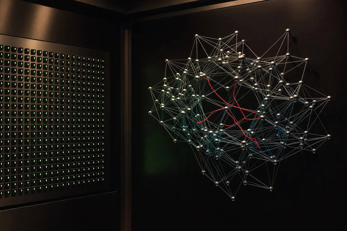
I built the dashboard I thought I wanted, and it did not fix the thing that was actually wrong.
The dashboard was the reasonable move and I do not regret it. My automation had been invisible, so I made it visible: every job got a receipt when it ran, a health check, a staleness clock, and a place on a board that shows the whole roster at once, green for fine, red for failed, amber for stale. It caught real failures I would have found days later or never. A board that goes green when the night's work finished is worth having, and I recommend building one.
But visible turned out not to be the same thing as legible, and the gap between those two words is this entire essay. With the board glowing green in front of me, I still could not answer the questions that actually mattered. If this job dies tonight, what goes quietly stale downstream of it? Which of these thirty-two rows is load-bearing and which are decoration? What has to run before what? The board had the state of every part and nothing whatsoever about the shape of the whole, and every question I cared about was a question about shape. By then I had typed the loops, so each one was legible alone. The whole stayed dark.
That is not a flaw in my dashboard. It is a flaw in dashboards. A list answers "what is the condition of each thing," and it answers well. It is structurally silent on "how do these things hang together," because the answer to that is not stored in any row. It lives between the rows, in the relationships, and a list throws the relationships away at the door.
Same data, different projection
Here is what finally worked, and the modest size of the change is the lesson I keep relearning. I added no data. No new instrumentation, no new collection, nothing measured that was not already measured. Each job in my registry already declared two plain facts about itself: what it reads, and what it writes. I had been rendering those facts as text in a table. I started rendering them as arrows instead. A job is a node. "This job reads what that job writes" is an edge. Same registry, same facts, different projection.
The picture that came back reorganized my understanding of a system I had personally written every line of. The jobs fell into columns nobody designed: sources on the left producing raw material, then the derivers that shape it, then the composers that assemble the shaped pieces, then, at the far right, the deliverers that push the finished thing out to where I actually see it. Left to right, the data moving the way water moves. I had built a watershed one creek at a time and never once seen the river system.
And across the top, the graph stated its one-line verdict on a year of my low-grade dread: thirty-two loops, fourteen in the dependency spine, eighteen with no internal dependencies at all. A short critical chain, not a tangle.
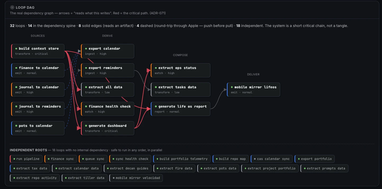
The actual panel. Left to right: sources, derive, compose, deliver, the water flowing the way water flows. Every red arrow is the critical path, and every red arrow traces back to the context store at the top left. The dashed lines are the dependencies that share no file. The bottom row is the eighteen loops that depend on nothing, listed flat because flat is what independence looks like.
I had been carrying the tangle version in my head the whole time. That is what an unseen system does: it gets imagined, and the imagination always draws the worst case, because a pile you cannot see is a pile you cannot bound. The truth was that more than half my loops depend on nothing and can run in any order, and the part with real structure is fourteen jobs in a chain short enough to trace with a finger. The relief was not that the system turned out simple. It is that the system turned out knowable, and the dread had been a rendering problem, not an engineering problem.
What the graph knows that the board cannot say
One node sat at the head of the chain, drawn in red because everything on the critical path descends from it: the job that builds the context store nearly everything else reads. I wrote that job on some ordinary day to solve some ordinary problem, and it has since become the root of the whole system, a promotion nobody announced, least of all to me. On the dashboard it is one green row among thirty-two green rows, visually identical to jobs that matter a hundred times less. On the graph it is unmistakably the keystone.
Which exposes the quiet failure a dashboard cannot even represent: every light green, and the system wrong anyway. If that root job silently produces stale output, every downstream job runs happily on old data, each one succeeds, each one stamps its receipt, and the board shows a wall of green describing a system that is confidently out of date. State is fine. Shape is broken. No row can say so, because the brokenness is not in any row. Now that I can see the root, I know exactly which single job to guard hardest, and I learned it from a picture instead of from an outage, which is the cheapest tuition there is.
Then there were the dashed arrows, and these are the part I would keep if I had to give the rest back. Most edges in the graph are ordinary: one job reads a file another job wrote. But four of them are drawn dashed because no shared file exists. They round-trip through the outside world. One job pushes an event out to my calendar; hours later a different job pulls the calendar back in, event included. Push, then pull, through Apple's servers in the middle. No common artifact, no visible connection, nothing on any list that would ever associate those two jobs. And the ordering between them is absolutely load-bearing: run the pull before the push and it quietly reads yesterday, misses today, and reports success. Nothing errors. Nothing goes red. A dependency that exists in no artifact, only in the shape of the system, is a dependency exactly one kind of view can show you, and it is not the kind with rows.
Orientation, not data
There is a question I have started asking of every surface I build, and it is the question this whole experience taught me to ask: does this improve my orientation while reducing the effort it costs to stay oriented? I wrote about that question as an objective function, and the dashboard and the graph split cleanly across it. The dashboard improved my orientation and charged me for it, because turning thirty-two rows into a mental model of the system is work, performed by me, again, on every glance. The graph did the work once, in the rendering. The shape arrives through my eyes instead of being reconstructed behind them. That is the difference between a view that contains the answer and a view that contains the ingredients of the answer, and I had spent a year paying the assembly cost without noticing it was on the bill.
More data was never the missing thing. Nobody drowning in a system they cannot see needs another metric. The missing thing was a projection, the one that matches the question. State questions want lists. Shape questions want graphs, and nearly every question that decides whether a system is understandable, what depends on what, what is load-bearing, what breaks first, is a shape question wearing work clothes.
I keep arriving at this same move from different directions. A month ago I built the link graph of this blog and found the site's real structure was not the one I imagined; its atlas is on the wall now. This time the territory was the machine that runs my days. Both times, the charting move was identical and the yield was identical: the pile became a place. That is what I mean when I say complexity should be made visible rather than reduced, and the loops taught me the precise version of it. The list told me what was running. The graph told me where I stand. Those are different products, and only one of them was ever going to lift the fog.